
Cohort aims to solve the fragmented student experience at Santa Monica College, where events and clubs were buried across scattered flyers, outdated web pages, and informal chats. I designed a centralized, mobile-first hub that integrates event discovery, group connections, and peer engagement into a single, intuitive platform. Grounded in user research and iterative testing, the app provides students with a trusted, inclusive resource to feel more connected to campus life.
In this video, I walk you through my case study and full design process.

12 weeks
2025
Product Design
Challenge
Students at Santa Monica College lack a centralized, trusted, and easy-to-use platform to discover campus events and clubs. This fragmentation, relying on outdated websites, scattered flyers, and exclusive group chats, leads to missed opportunities and feelings of disconnection, especially for commuter and international students.
Results
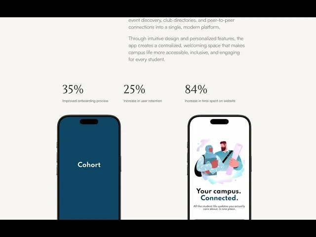
A mobile-first student hub that seamlessly integrates event discovery, club directories, and peer-to-peer connections into a single, modern platform.
Through intuitive design and personalized features, the app creates a centralized, welcoming space that makes campus life more accessible, inclusive, and engaging for every student.
35%
Improved onboarding process
25%
Increase in user retention
84%
Increase in time spent on website


Process
Research & Analysis:
I grounded the project in user-centered research, conducting interviews and surveys to understand core pain points and motivations. I complemented this primary data with a competitive analysis of industry trends, which allowed me to identify key gaps and opportunities in the market.
Information Architecture:
Synthesizing insights from my research, I re-envisioned the app's structure to prioritize user goals. I streamlined the navigation and reorganized content into an intuitive hierarchy, ensuring users could find key features and information effortlessly.
Wireframing & Prototyping:
I translated the structural concepts into low-fidelity wireframes to map user flows and test layout efficiency. Through iterative feedback cycles, I refined these concepts into a high-fidelity, interactive prototype that brought the final user experience to life for testing.
Usability Testing:
I validated my design decisions through moderated usability testing with a diverse group of target users. Their feedback provided critical insights into navigational intuition and usability, which directly informed my final refinements to the prototype.
Visual Design & Style Guide:
I developed a cohesive visual system—defining a purposeful color palette, accessible typography, and a suite of custom icons—to create a distinctive and emotionally resonant brand identity. I then formalized this into a comprehensive style guide to ensure consistency and efficiency across all future development.


Research
To move beyond assumptions, I grounded the project in both primary and secondary research, uncovering where existing tools fell short and what students actually needed:
Heuristic Evaluation
started by evaluating existing tools like Reddit threads, Discord groups, and TikTok videos about SMC life using Jakob Nielsen’s usability heuristics. Key issues stood out:Interfaces overloaded with clutter, burying event detailsNo feedback loops — unanswered posts and outdated info lingeredLimited discoverability, requiring “insider knowledge” to find eventsThis made one thing clear: these platforms weren’t built for students.
Competitive Analysis
I then compared direct competitors (Handshake, CampusGroups, Discord) and indirect ones (Reddit, Facebook Events).Strengths: event listings, chat functionalityWeaknesses: lack of personalization, outdated design, failure to integrate events and community into one experienceThe opportunity was clear: design a mobile-first student hub that combined discovery, connection, and engagement in a single, modern platform.
User Interviews
To capture student perspectives, I spoke with peers and classmates about how they discover events and make connections. Their voices revealed the real pain points:“I never know what’s going on — everything feels scattered or outdated.”“It’s hard to find groups unless you already know someone.”“Most events I hear about are after they’ve already happened.”
I also tapped into online forums like Reddit, TikTok, and Quora to broaden my understanding.
Key themes emerged:
-Commuter and international students feel especially disconnected
-There’s a desire for inclusive, non-drinking social spaces
-Students want a trusted, centralized hub that’s visually engaging and easy to use
Key Takeaway: Existing platforms weren’t solving the right problems. Students didn’t just want another calendar or bulletin board — they needed an accessible, intuitive, and social platform to discover and engage with campus life.

“Most events I hear about are after they’ve already happened. It makes staying connected with other students extremely difficult." - Ana, primary user
Ideation
With research in hand, the challenge became turning student frustrations into tangible design opportunities. I began sketching early concepts to explore how a centralized hub could feel approachable, modern, and intuitive. The goal was to make navigating campus life feel less like searching for a needle in a haystack and more like opening a clear, welcoming map.
I mapped out potential features — from event discovery and club directories to peer-to-peer connections — then tested how they might flow together into a seamless experience. Sticky notes and sketches helped me cluster ideas, identify overlaps, and prioritize features that would deliver the most impact without overwhelming the user.
Key questions during ideation included:
-How can students discover events without scrolling endlessly?
-How can groups feel easy to join, even for new or commuter students?
-How can the interface signal trust, inclusivity, and ease of use?

Prototyping
From there, I moved into low-fidelity wireframes, focusing on structure and usability before visuals. Each screen was designed with simplicity in mind — clean layouts, intuitive navigation, and a hierarchy that highlighted what mattered most: what’s happening now and how to join in.I tested these early wireframes with peers to validate whether the flows made sense.
Feedback showed that students wanted quicker access to “what’s happening today” and more personalized recommendations, which directly shaped the next iteration. Once the foundations felt strong, I translated wireframes into high-fidelity prototypes. This stage emphasized clear typography, bold imagery, and a visual language that felt both vibrant and welcoming. The prototypes told a story: a student opening the app could immediately see what events were happening, explore groups, and connect with peers in just a few taps.
Conclusion
This project underscored that a successful solution isn't just about features, but about designing for real-world constraints like information sprawl and student schedules. I learned the critical importance of a mobile-first, centralized hub that prioritizes intuitive discovery over complex functionality, directly combating the fragmentation that isolates students. The outcome, Cohort, proves that a focused, user-centered platform can effectively bridge the gap between students and their campus community.

