
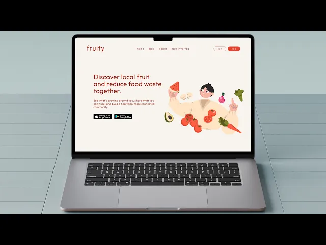
Los Angeles is overflowing with fruit trees: oranges, lemons, figs, avocados and yet so much of this abundance ends up rotting on sidewalks. At the same time, many residents struggle with food access, high grocery costs, and limited opportunities to connect with fresh, organic produce.
Solutions like community gardens exist, but long waitlists, safety concerns, and lack of accessibility keep them out of reach for many. This tension revealed a clear gap: despite having the resources around us, there wasn’t an easy or trusted way to share them.

12 weeks
Santa Monica, CA
Product Design
Challenge
The app had a cluttered interface, making it difficult for users to navigate and find essential features. Users were facing issues with the onboarding process, which was affecting new user adoption rates. The app lacked personalization and customization options, making it less engaging and user-friendly.
Results
Fruity demonstrates how design can turn overlooked challenges into opportunities for connection and sustainability. Grounded in research and real stories, the project reimagines food access as a joyful, community-driven experience while reinforcing my belief that good design begins with listening.
80%
of users could find local fruit trees within 5 minutes.
70%
would contribute new fruit tree locations.
84%
rated the app easy to navigate.


Process
Research & Exploration: I conducted user interviews and secondary research to uncover pain points and opportunities. I also reviewed competitor apps and industry examples to better understand trends and gaps.
Information Architecture: Using these insights, I mapped out the app’s navigation and content structure, focusing on simplicity and prioritizing the features students would find most valuable.
Wireframing & Prototyping: I created low-fidelity wireframes to explore different layouts and user flows. Through feedback from peers and iterative refinements, I built a high-fidelity interactive prototype to bring the concept to life.
Usability Testing: I tested the prototype with classmates and peers to validate whether the flows felt intuitive. Their feedback directly informed refinements that made the app more approachable and user-friendly.
Visual Design: I designed a cohesive visual system, defining colors, typography, and iconography that supported the app’s personality and usability. A lightweight style guide ensured consistency across screens and components.


Discovery: Finding the gaps
Fruity began with a simple realization. Los Angeles is full of fruit trees, yet so much of that produce ends up unused. I started asking myself: what if finding and sharing fruit could be as effortless as opening an app?
To explore this, I first looked at the tools that already existed. What I found revealed the gaps that Fruity could fill:
Existing platforms felt outdated and cluttered, making even simple tasks confusing
Most lacked a sense of community, treating the experience as a transaction rather than a connection
The process of locating or sharing fruit often took too many steps, discouraging users from following through
From these early observations, one thing became clear. People didn’t just need a functional directory of trees. They needed a platform that felt approachable, modern, and rooted in community. Fruity’s vision grew from this moment — to design something that makes sharing abundance not only simple, but joyful.
Research: Understanding the landscape
Designing Fruity wasn’t just about creating a nice interface. It began with understanding why existing solutions weren’t working and what people in Los Angeles actually needed. I combined both primary and secondary research methods to build a clear picture of the problem space.
First, I conducted a heuristic evaluation of existing fruit-sharing and food access platforms. Using Jakob Nielsen’s usability principles as a guide, I found recurring issues such as complex navigation that buried key actions, visual clutter that distracted instead of guided, and a lack of feedback loops that left users unsure whether their contributions were successful. This confirmed that many of the current tools were unintuitive and didn’t align with user goals.
Next, I ran a competitive analysis to compare direct competitors like Fallen Fruit and RipeNearMe with indirect competitors such as food rescue and sustainability apps. Some offered strengths like basic maps or community-sharing functions, but most lacked modern design systems, strong community features, or accessibility considerations. From this, I saw a clear opportunity: Fruity needed to stand out by being community-focused, visually simple, and easy to navigate.
Taken together, these methods revealed both the gaps in current solutions and the real needs of the community. Fruity became an opportunity not just to build another app, but to create a platform that feels accessible, safe, and joyful for anyone who wants to share or discover local fruit.
From the insights gathered during research, I created Jason, a representative user persona. By synthesizing patterns from interviews, surveys, and observations, I highlighted key behaviors, goals, and frustrations that real users experienced when searching for local fruit. This persona helped guide design decisions for Fruity, ensuring features were tailored to meet user needs and create a more intuitive, enjoyable experience.

“ I love fresh fruit, but tracking down local trees takes too much time. An app that shows them all would be amazing.” Jason, primary user


Prototyping & Refinement
My first prototypes leaned too heavily on text and overcomplicated flows — ironically recreating the very frustrations users had voiced in interviews.
Through iteration, I stripped down unnecessary steps and refined the experience:
Simplified forms for adding fruit (just the essentials).
Cleaner layouts with bold typography for legibility.
Imagery that tells a story — fruit not just as produce, but as symbols of abundance and sharing.
Clear CTAs that guide users through the journey without overwhelming them.
I tested these flows informally with peers and classmates, gathering feedback on what felt intuitive versus confusing.
This feedback loop helped me refine the map navigation, simplify the listing flow, and rethink how the onboarding screens guided users into the experience.
With the core structure in place, I focused on the visual system. Fruity needed to balance trustworthiness with playfulness:
Color palette: warm, organic tones inspired by nature, paired with clean neutrals for accessibility.
Typography: modern, geometric typefaces that felt approachable yet precise.
Icons: simple, intuitive shapes that carried a hint of playfulness to keep the app approachable.
The end result was a design system that felt consistent, inviting, and aligned with Fruity’s mission.
Conclusion
While Fruity is a student concept project, it highlights how design can transform overlooked problems into meaningful solutions. The platform reframes food access not just as a matter of logistics, but as an opportunity for community, sustainability, and shared abundance.
For me, Fruity reinforced an important truth: good design starts with listening. By grounding the project in research, real stories, and iterative refinement, I was able to craft a concept that feels both useful and joyful.
